library(dplyr)
library(RedditExtractoR)
library(rnaturalearth)
library(ggplot2)
library(tidytext)
library(png)
library(ggwordcloud)
library(stringr)
library(patchwork)
library(tidyr)How are people reacting to the 2024 US Presidential Election?
r/conservative and r/politics
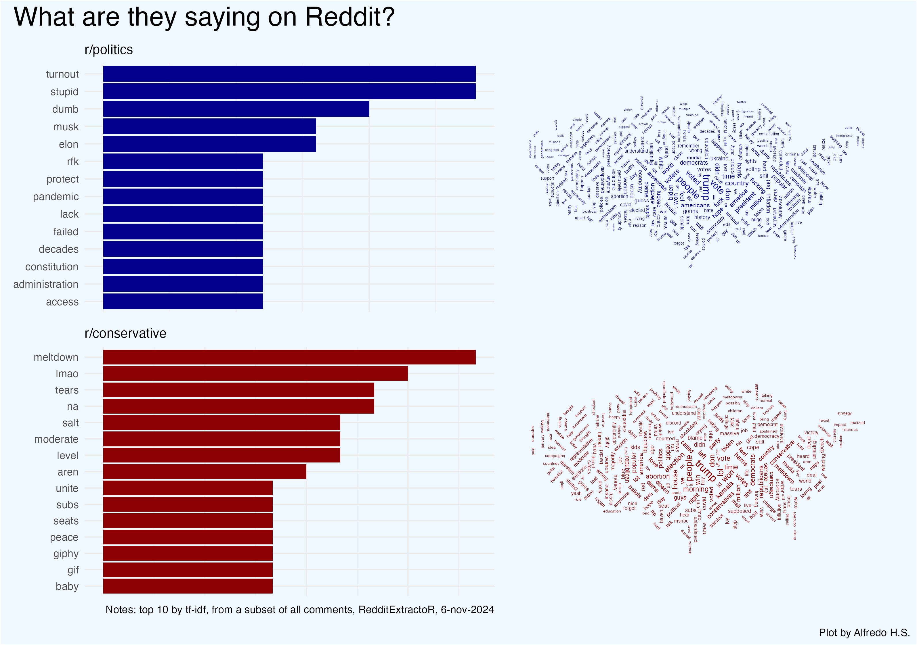
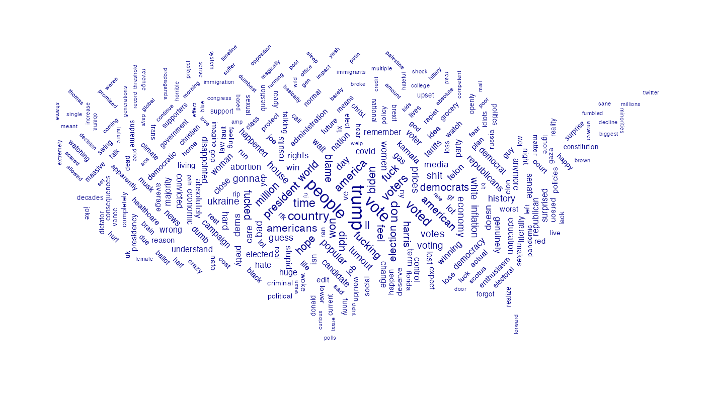
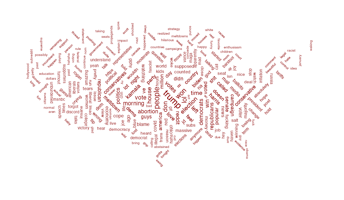
The plot below shows the top 10 words (by TFI-IDF) used in two Reddit megathreads on the election results: r/conservative is a right leaning subreddit while r/politics tends to skew liberal. The word clouds show the top 300 terms used in a sample of comments from each thread.
Here’s a step-by-step guide for re-creating this visualization. Please keep in mind that the comments you might retrieve with the RedditExtractoR package will differ from the sample below depending on the time and data of request.

Step 1: Set Up Libraries
Load the necessary libraries for data manipulation, Reddit extraction, and visualization:
Step 2: Retrieve Data from Reddit
Use RedditExtractoR to pull comments from threads on r/conservative and r/politics. This data was accessed on November 6th, 2024.
df_conservative <- get_thread_content("https://www.reddit.com/r/Conservative/comments/1gkjwkx/2024_presidential_election_live_thread/")$comments %>%
  select(comment) %>%
  mutate(class = "rconservative")

df_liberal <- get_thread_content("https://www.reddit.com/r/politics/comments/1gkvs8e/megathread_donald_trump_is_elected_47th_president/")$comments %>%
  select(comment) %>%
  mutate(class = "rpolitics")

df_comments <- bind_rows(df_conservative, df_liberal)
Step 3: Clean and Tokenize the Data
Convert all text to lowercase, remove punctuation and digits, and then tokenize. Another option is to tokenize words as bigrams
df <- df_comments %>%
  mutate(
    text = tolower(comment),
    text = str_replace_all(text,"[:punct:]", " "),
    text = str_remove_all(text,"[:digit:]")
  )

tidy_tokens <- df %>%
  unnest_tokens(word, text) %>%
  anti_join(stop_words) %>%
  group_by(class) %>%
  count(word, sort = T) %>%
  ungroup()

tidy_bigrams <- df %>%
  unnest_tokens(word, text) %>%
  anti_join(stop_words) %>%
  group_by(comment, class) %>%
  summarize(text = paste(word, collapse = " ")) %>%
  ungroup() %>%
  unnest_tokens(bigram, text, token = "ngrams", n = 2) %>%
  separate(bigram,
           into = c("word1", "word2"), sep = " ") %>%
  filter(!is.na(word1) & !is.na(word2)) %>%
  unite("bigram", word1, word2, sep = "-") %>%
  group_by(class) %>%
  count(bigram, sort = TRUE) %>%
  ungroup()
Step 4: Normalize tokens by TF-IDF
TF-IDF (Term Frequency-Inverse Document Frequency) is a statistical measure that evaluates how important a word is to a document within a collection, by balancing the word’s frequency in the document against its prevalence across all documents; it helps highlight words that are unique to specific contexts, making it valuable for identifying distinguishing terms in text analysis.
tidy_tfidf <- tidy_tokens %>%
  bind_tf_idf(word, class, n)
Step 5: Create Bar Charts of Top Terms
Create the visualizations of the top terms in each subreddit by TF-IDF with ggplot. We store these plots into two objects (liberal_counts and conservative_counts)
liberal_counts <- tidy_tfidf %>%
  filter(class == "rpolitics") %>%
  top_n(tf_idf, n = 10) %>%
  ggplot(aes(y = reorder(word,n), x = n)) +
  geom_col(fill = "darkblue") +
  labs(x = NULL,
       subtitle = "r/politics",
       y = NULL) +
  theme_minimal() +
  theme(axis.text.x = element_blank())

conservative_counts <- tidy_tfidf %>%
  filter(class == "rconservative") %>%
  top_n(tf_idf, n = 10) %>%
  ggplot(aes(y = reorder(word,n), x = n)) +
  geom_col(fill = "darkred") +
  labs(x = NULL,
       subtitle = "r/conservative",
       caption = "Notes: top 10 by tf-idf, from a subset of all comments, RedditExtractoR, 6-nov-2024",
       y = NULL) +
  theme_minimal() +
  theme(axis.text.x = element_blank())
Step 6: Prepare a Map for Word Clouds
Retrieve a U.S. map to serve as a mask for word clouds. A mask is an image in black and white that will be used by ggwordcloud to guide the shape.
us <- ne_countries(scale = "medium",
                   country = "United States of America",
                   returnclass = "sf")

cloud_map <- ggplot(data = us) +
  geom_sf(fill = "black", color = NA) +
  coord_sf(xlim = c(-125, -66.9), ylim = c(24.5, 49.5)) +
  theme_void() +
  theme(
    panel.background = element_rect(fill = NULL, color = NA),
    plot.background = element_rect(fill = NULL, color = NA)
  )

ggsave("us_mainland_mask.png",
       plot = cloud_map,
       width = 10, height = 6,
       units = "in", dpi = 300)
Step 7: Generate Word Clouds
Create word clouds for each subreddit, masked to fit the U.S. map outline:
liberal_plot <- tidy_tokens %>%
  filter(class == "rpolitics") %>%
  top_n(n, n = 300) %>%
  mutate(angle = 45 * sample(-2:2, 322, replace = T)) %>%
  ggplot() +
  geom_text_wordcloud(
    aes(label = word,
        size = n,
        angle = angle
        ),
    color = "darkblue",
    mask = png::readPNG("us_mainland_mask.png")
                      ) +
  scale_size_continuous(range = c(1,3)) +
  theme_void()
conservative_plot <- tidy_tokens %>%
  filter(class == "rconservative") %>%
  top_n(n, n = 270) %>%
  mutate(angle = 45 * sample(-2:2, 274, replace = T)) %>%
  ggplot() +
  geom_text_wordcloud(
    aes(label = word,
        size = n,
        angle = angle
    ),
    color = "darkred",
    mask = png::readPNG("us_mainland_mask.png")
  ) +
  scale_size_continuous(range = c(1.2,3)) +
  theme_void()
Step 8:
Use patchwork to combine bar charts and word clouds into a final visualization:
pooled <-
  (liberal_counts + liberal_plot) / (conservative_counts + conservative_plot) +
  plot_annotation(
    title = "What are they saying on Reddit?",
    caption = "Plot by Alfredo H.S.",
    theme = theme(plot.title = element_text(size = 22),
                  plot.background = element_rect(fill = "aliceblue")
                  )
                  )

ggsave("pooled_plot.png",
       width = 27,
       height = 19,
       plot = pooled,
       units = "cm")