library(rmapshaper)

subnat_map = st_read("GDL Shapefiles V6.3 large.shp") %>%
  st_transform(4326) %>%
  st_as_sf()

chunks <- split(subnat_map,
                rep(1:ceiling(nrow(subnat_map)/100), each = 100, length.out = nrow(subnat_map)))

simplified_chunks <- lapply(chunks, function(chunk) {
  ms_simplify(chunk, keep = 0.1, keep_shapes = TRUE)
})

subnat_map_simplified <- do.call(rbind, simplified_chunks)

saveRDS(subnat_map_simplified, "subnat_map_simplified.rds")Corruption and HDI in Sub-Saharan Africa (2021)
Bivariate Choropleth Map

Bivariate Choropleth Maps
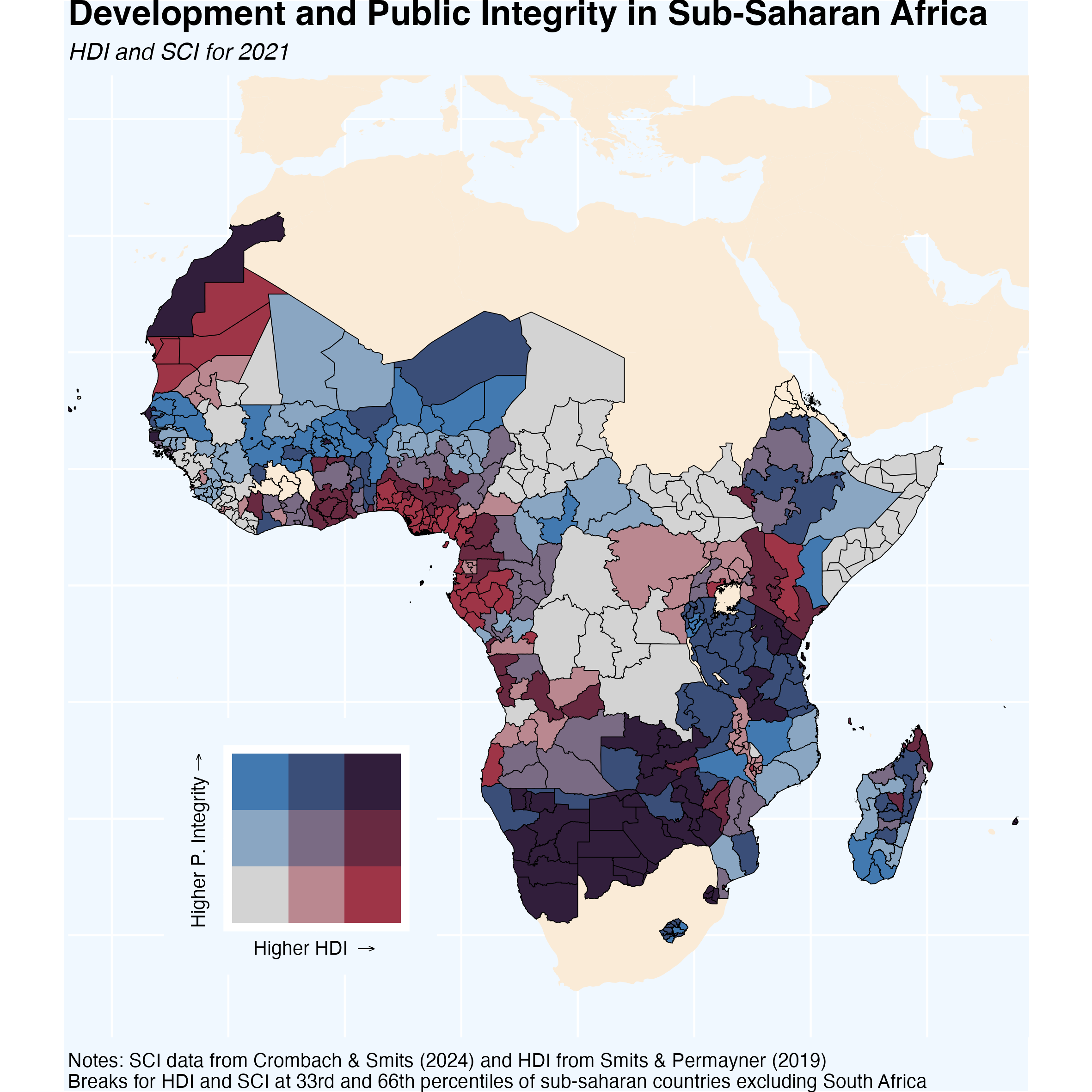
These types of maps often get a bad rap. Critics argue that they can be confusing or overwhelming, but I respectfully disagree. When crafted carefully, these maps can provide a clear, nuanced view of complex data.
The map above shows the relationship between Human Development Index (HDI) and public integrity across Sub-Saharan Africa. The visual design helps to emphasize patterns and disparities across regions, making it easier to grasp the broader picture at a glance.
Where does the data come from?
This map was constructed using data on corruption collected by Crombach and Smits (2024) and data on sub-national human development index from Smits and Permanyer (2019). The data – including the shapefiles – can be downloaded here
How was this map made?
Shape files are an important part of every map. The original shapefiles for subnational data are taken from GDL. This mape uses a simplified version using the code below!
With that out of the way, we can plot the bivariate choropleth map! For more on how to make these fun maps with biscale see this post.
library(dplyr)
library(ggplot2)
library(sf)
library(rnaturalearth)
library(readr)
library(biscale)
library(cowplot)
library(stringr)

# Get Corruption Data
corruption_data_full <- read_csv("GDL-CorruptionData-1.0.csv") %>%
  filter(year == 2021,
         level == "Subnat")

# Get HDI Data
hdi_data_full <- read_csv("SHDI-SGDI-Total 7.0.csv") %>%
  filter(year == 2021,
         level == "Subnat") %>%
  select(GDLCODE, shdi)


# Get Map Data
subnat_map_simplified <- readRDS("subnat_map_simplified.rds")

world <- ne_countries(scale = "medium", returnclass = "sf")

# Clean Data
sub_africa <- subnat_map_simplified %>%
    filter(continent == "Africa",
           !iso_code %in% c("DZA", "EGY", "LBY",
                            "MAR", "SDN", "TUN",
                            "ESH", "ZAF"))

# Make Bivariate Choropleth data

full_data <- left_join(corruption_data_full, hdi_data_full) %>%
  select(GDLCODE, shdi, fullsci) %>%
  rename(gdlcode = GDLCODE)

bi_data <- bi_class(full_data %>%
                      na.omit() %>%
                      filter(gdlcode %in% unique(sub_africa$gdlcode))
                      ,
                    x = shdi,
                    y = fullsci,
                    style = "quantile", dim = 3)

sub_africa <- left_join(sub_africa, bi_data)

# Map it
map <- world %>%
  ggplot() +
  geom_sf(color = NA, fill = "antiquewhite") +

  geom_sf(data = sub_africa, mapping = aes(fill = bi_class),
          color = "black", size = 0.1, show.legend = FALSE) +
  bi_scale_fill(pal = "DkViolet2", dim = 3, na.value = "antiquewhite") +

  coord_sf(
    ylim = c(-35, 40),  # Latitude: South to North
    xlim = c(-20, 55)   # Longitude: West to East
  ) +

  labs(title = "Development and Public Integrity in Sub-Saharan Africa",
       subtitle = "HDI and SCI for 2021",
       caption = "Notes: SCI data from Crombach & Smits (2024) and HDI from Smits & Permayner (2019) \nBreaks for HDI and SCI at 33rd and 66th percentiles of sub-saharan countries excluding South Africa") +
  theme(
    panel.background = element_rect(fill = "aliceblue"),
    plot.background = element_rect(fill = "aliceblue"),
    legend.background = element_rect(fill = NA),
    legend.position = c(0.95, 0.95),
    plot.caption = element_text(size = 10, hjust = 0),
    legend.direction = "horizontal",
    legend.title.position = "top",
    legend.key.height = unit(.5, "cm"),
    legend.key.width = unit(2, "cm"),
    legend.justification = c(1, 1),
    panel.border = element_blank(),
    axis.ticks = element_blank(),
    axis.text = element_blank(),
    axis.title = element_blank(),
    plot.title = element_text(size = 18, face = "bold"),
    plot.subtitle = element_text(size = 12, face = "italic"),
    plot.margin = margin(0, 0, 0, 0)
    )

legend <- bi_legend(pal = "DkViolet2",
                    dim = 3,
                    xlab = "Higher HDI ",
                    ylab = "Higher P. Integrity",
                    size = 10) +
  theme(plot.background = element_rect(fill = "aliceblue"))

finalPlot <- ggdraw() +
  draw_plot(map, 0, 0, 1, 1) +
  draw_plot(legend,
            .15,
            .1,
            .25, # along x axis
            .25) # size of box

ggsave("map_africa.png", width = 20, height = 20, units = "cm")