# Load the libraries
library(dplyr)
library(ggplot2)
library(sf)
library(rnaturalearth)
library(readr)
library(gganimate)
library(gifski)

# Get Corruption Data
corruption_data_full <- read_csv("GDL-CorruptionData-1.0.csv")

corruption_subnat <- corruption_data_full %>%
  filter(iso_code == "BRA",
         level == "Subnat") %>%
  select(year, region_sci, fullsci, GDLCODE) %>%
  mutate(clean_name = stringi::stri_trans_general(region_sci, "Latin-ASCII"),
         clean_name = case_when(
           clean_name == "dirty_name" ~ "clean_name",
           TRUE ~ clean_name
         ),
        clean_name = tolower(clean_name),
        corruption = 100-fullsci
         )

# Get Map Data
world <- ne_countries(scale = "medium", returnclass = "sf")

subnational_map <- ne_states(country = "Brazil", returnclass = "sf") %>%
  mutate(
    clean_name = stringi::stri_trans_general(woe_name, "Latin-ASCII"),
    clean_name = tolower(clean_name)
  )

# Inspect that region names overlap
unique(subnational_map$clean_name)[!unique(subnational_map$clean_name) %in% unique(corruption_subnat$clean_name)]

# Merge the data
subnational_map <- subnational_map %>%
  select(clean_name, geometry)

corruption_subnat <- corruption_subnat %>%
    select(clean_name, year, corruption)

full_map <- left_join(
  corruption_subnat,
  subnational_map
)

# Create the animated plot
animated_map <- ggplot() +
  geom_sf(data = world) +
  geom_sf(data = full_map,
          aes(fill = corruption, geometry = geometry),
          color = "black") +
  scale_fill_viridis_c(option = "plasma", na.value = "grey50") +
  coord_sf(ylim = c(-35, 5),
           xlim = c(-75, -25)) +
  labs(fill = "Subnational Corruption Index",
       title = "Year: {closest_state}",
       caption = "Source: Crombach and Smits (2024). Transformed full SCI score.\nHigher values indicate higher levels of corruption.") +
  theme(
    panel.background = element_rect(fill = "aliceblue"),
    plot.background = element_rect(fill = "aliceblue"),
    legend.background = element_rect(fill = NA),
    legend.position = c(0.95, 0.95),
    plot.caption = element_text(size = 15),
    legend.direction = "horizontal",
    legend.title.position = "top",
    legend.text = element_text(size = 15),
    legend.title = element_text(size = 15),
    legend.key.height = unit(.5, "cm"),
    legend.key.width = unit(2, "cm"),
    legend.justification = c(1, 1),
    panel.border = element_blank(),
    axis.ticks = element_blank(),
    axis.text = element_blank(),
    axis.title = element_blank(),
    plot.title = element_text(size = 30, face = "bold"),
    plot.margin = margin(0, 0, 0, 0)
  ) +
  transition_states(year, transition_length = 3, state_length = 1) +
  ease_aes('cubic-in-out')


# Animate and save the GIF
export_anim <- animate(animated_map,
        renderer = gifski_renderer(),
        duration = 15,
        fps = 15,
        width = 800,
        height = 800)

anim_save("corruption_map.gif", animation = export_anim)

How is corruption measured here?
Corruption has many connotations and meanings. The most widely accepted definition comes from Transparency International as “the abuse of entrusted power for private gain”.
Though there are some exceptions, corruption is mostly measured through surveys on direct experiences or perceptions of corruption (Fazekas and Hernández Sánchez 2021).
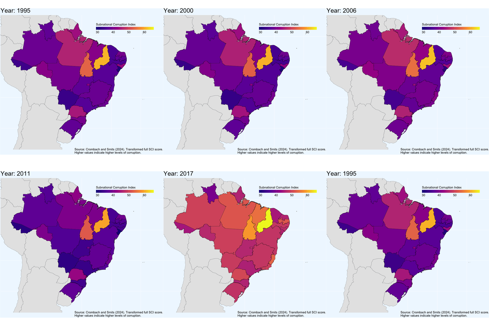
In the figure above, corruption is measured from 0-100, with higher values indicating higher levels of perceived grand and petty corruption by sub-national unit in a given year.
Where does the data come from?
This map was constructed using data collected by Crombach and Smits (2024). The Subnational Corruption Database (SDC) “is constructed by combining data of 807 surveys held in the period 1995–2022 and includes the corruption experiences and perceptions of 1,326,656 respondents along 19 separate dimensions.”
The research paper which details the exact methodology can be found here and the data can be downloaded here